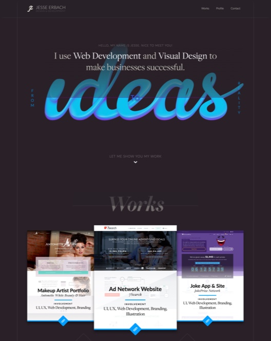
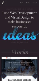
Despite having launched many client websites and brands, by far my most challenging experience was creating for myself. Between squeezing in the time and meeting my own expectations, it turned out to be a longer ride than I had anticipated. And although I always see areas I can improve, in the end was something I was proud of creating.
Branding
My branding is an important part of what I do. It ensures people have something unique to tie to my work. Something for business cards, watermarks and all the other nifty little things that come with a neatly packaged brand.
Branding is normally representative of something. In this instance, the brand is my name. But it also represents what I do. So I decided I’d create a monogram of sorts, that was creative enough that it would be a good representation I what I can do. But minimal enough that it would be usable wherever I needed to place it.
The logo type it self would be a no-frills sans-serif font.

Illustration
I wanted to make something that would show I’m a capable illustrator but also a good developer. I decided I would create something that could be animated with javascript. Something with layers that could be revealed but made as a highly manipulatable SVG graphic.
So I made something that I thought encompassed what I’m all about. Turning ideas into reality. The word ‘ideas’ would be the cornerstone of the animation. After sketching out the idea on good ol’ fashion pen and paper, I set out to make it a vector in Illustrator. Then I’d give it dimension by shading and highlighting it using a pressure sensitive tablet.
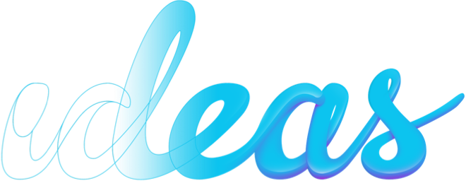
Each of the letters was a completely different vector shape. Sometimes broken into more than one shape for ease of animation. The shaded component was actually a raster image but by nesting it in an svg it essentially became part of the vector graphic. Able to be assembled piece by piece with SVG masks.
UI/UX Design
Originally, I wanted to make a very minimal site with no large images on the homepage to keep resource overhead down. But I later backed away from that idea, realizing that without images there wasn’t a good way to immediately convey my full value as a web designer and developer.
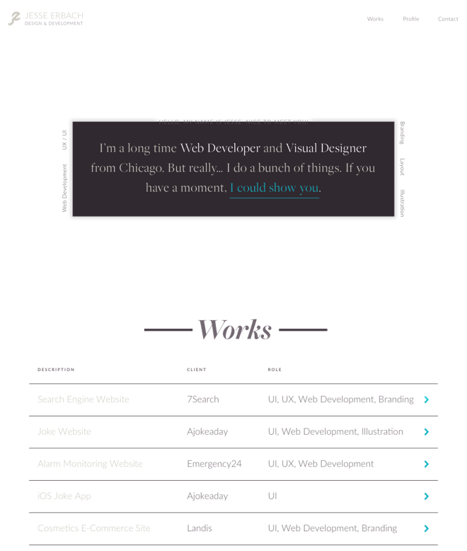
After revising the site further and adding imagery, I wanted to make sure the site had a stronger sense of consistency. The color theme was reinforced and all action elements, error messages and gradients were now consistent with one another.

Beyond that typography was further unified as well. With headings, paragraphs and subtitles sharing united themes based on hierarchy and importance.

Ultimately the goal of the user experience was to encourage as much engagement as possible. To get users to look at projects and reach out via the contact form. Subtle cues are throughout the site to encourage that behavior, like project links in key locations and an accessible contact form.
Web Development
For implementation of the design, I wanted a component based application. This would make it easy to separate the concerns of each part of the site and tweak performance based on more fine grained functionality. Also, I wanted to minimize any of the problems that come with reloading the entire page when a user requests a new view. The server should be completely aware of what the client was rendering.
Ultimately this led me toward building a universal (isomorphic) web application. This approach met all the above goals and allowed me to structure the source code in a way that was very extendable to functionality I knew I wanted to have later. The architecture for this approach also made end to end testing fairly easy.
The web application is entirely JavaScript based. The backend is Node.js and Express (although I may switch to Koa). The view is displayed with React and data is managed via Redux with some help from GraphQL.
React is a favorite of mine, as the way it handles functionality really helps me to think about how to best implement functionality from the perspective of the user. Things like props and jsx keep all the important details of my components in one place and allows me to take larger components and break it down to even smaller snippets of functionality (that again, is easier to test). Combined with Redux handling immutable data and encouraging stateless component design, I was left with an app that was both easy to scale and easily able to exactly match my proposed user experience.
But although the site is built around JavaScript technologies, it was important that it remains accessible. Using progressive enhancement, the site is completely accessible when JavaScript is disabled. In addition all browsers, mobile or desktop (from IE9 onwards), receive a nearly identical user experience.
Once local development came to a close, all that was left was to pick out a deployment strategy. After examining hosting options I went with an Elastic Beanstalk setup from Amazon Web Services. Its combination of configuration freedom and easy deployment options made it very appealing. Along with the load balancing options, this seemed like a solid choice for site performance.
I was already using webpack for local development so I decided to extend this for use in deployment. Using webpack, I made easy to use deployment commands (i.e. npm run awsDeploy) that would build a production ready directory then package it for consumption by the AWS environment. This included configuration options set via .ebextensions that adjusted load balancer options, environment variables, nginx configurations and more.
Although the AWS setup offered many asset delivery optimizations out of the box, I wanted to be able to deliver assets without worry of scale or the users location. Nothing is more disappointing then having the user experience interrupted by downloading images and scripts. I used a content delivery network to be able to alleviate this problem.
But I was still left feeling that I can optimize this some more. So I implemented the WebP image format for browsers that support it. This highly compressed image format improved the download size of image assets by upwards of 70%. With all other assets being gzipped the site was now running silky smooth in most setups, even when throttling down to 3G speeds.
This left me enough room to provide even higher resolution assets to users on high dpi devices (like 4k monitors and most mobile devices). But of course, these optimized graphics would only be delivered to those who were able to use them. No matter the device I wanted to ensure the highest fidelity combined with the most efficient asset delivery possible.

Beyond assets I wanted the site to be http2 ready. So all assets as well as the base site are delivered via https. This allows the future implementation of http2 as well as service workers, not to mention the SEO benefits of being on https. This will also allow for a more secure experience once the client portal is introduced in the next big update. Beyond that, there are also many security related features behind the scene like HTTP Strict Transport Security, XSS protection and input sanitation.
All and all, the creation of this site was a lot of work but hopefully you find it performs well and is easy to use. I look forward to any feedback you might have. Reach out to me and let me know what you think and thanks for reading!
